Penny’s Butchers


Penny’s Butchers
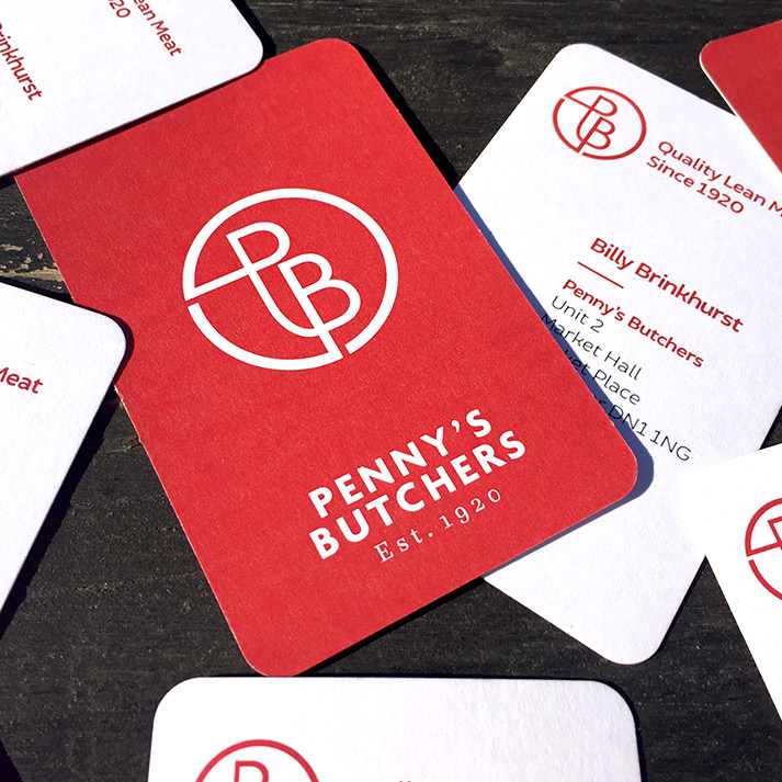
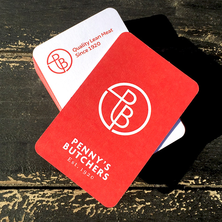
A butchers that has been established since 1920 required a brand refresh and we were approached by the new owners with this brief. Known by its locals as ‘Penny’s’ with a stand-out colour of red our job was to give the whole brand a refresh whilst keeping these key elements and without losing the reputation it has built with loyal customers over the years.
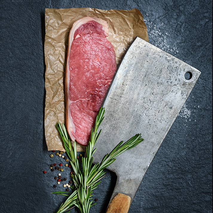
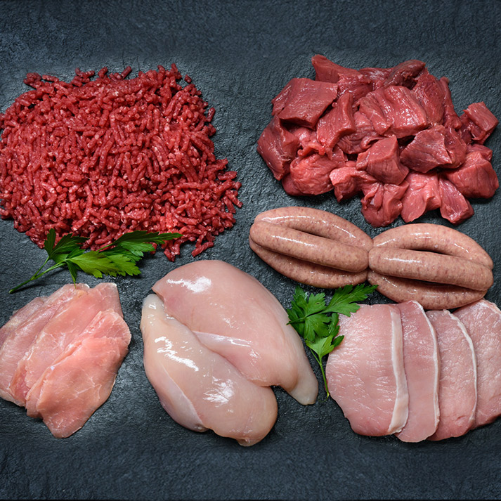
We created a strong, yet simple identity that works well on all marketing material from stationery to uniform to signage as well as online with social media. Alongside this we organised an on-site photography shoot of striking imagery to really get across the high quality meat products on sale.
Photography Credit: Ben Harrison
Category
Branding, Graphic Design, Photography, Print, Typography


